Making it easier to request information from German public authorities
About this project
FragDenStaat is a German civic tech organization that promotes transparency and access to information held by public authorities or government agencies.
They operate an online platform where users can submit so-called freedom of information requests and track their progress. Authorities are legally required to answer these requests.
More information on Freedom of Information by the Open Knowledge Foundation Deutschland
In this project, I was tasked with improving the usability of the platform. Our aim was to better support and inform users when they submit a freedom of information request, and to remove obstacles that typically hinder this process.
WHAT
Redesigning the key user flow on fragdenstaat.de to improve usability, particularly for first-time users
TIMELINE
Apr 2022 – July 2023 (1-2 days/week)
Team
Me (UX/UI design), Head of Operations, two developers
TOOLS
Figma, Miro, Optimal Workshop
Process
Research
UX audit, stakeholder interviews
To identify problems and pain points with the current version, I conducted a UX audit and collected feedback from stakeholders about known issues with the platform.
Ideation
User flow,
low-fi wireframes
I drafted a user flow and low-fi wireframes to address the problems identified during the research phase.
Testing & iteration
Usability testing, revisions
We ran moderated usability tests with seven participants across different levels of experience. Participants were asked to carry out scenario tasks using a clickable prototype. Based on the test findings, I revised details of the wireframes.
General strategy
Take a quick look at the previous flow (left) and the new one (right). You'll notice that we've added several steps (represented by green nodes). Why did we make the flow longer? Wasn’t the idea to simplify it?
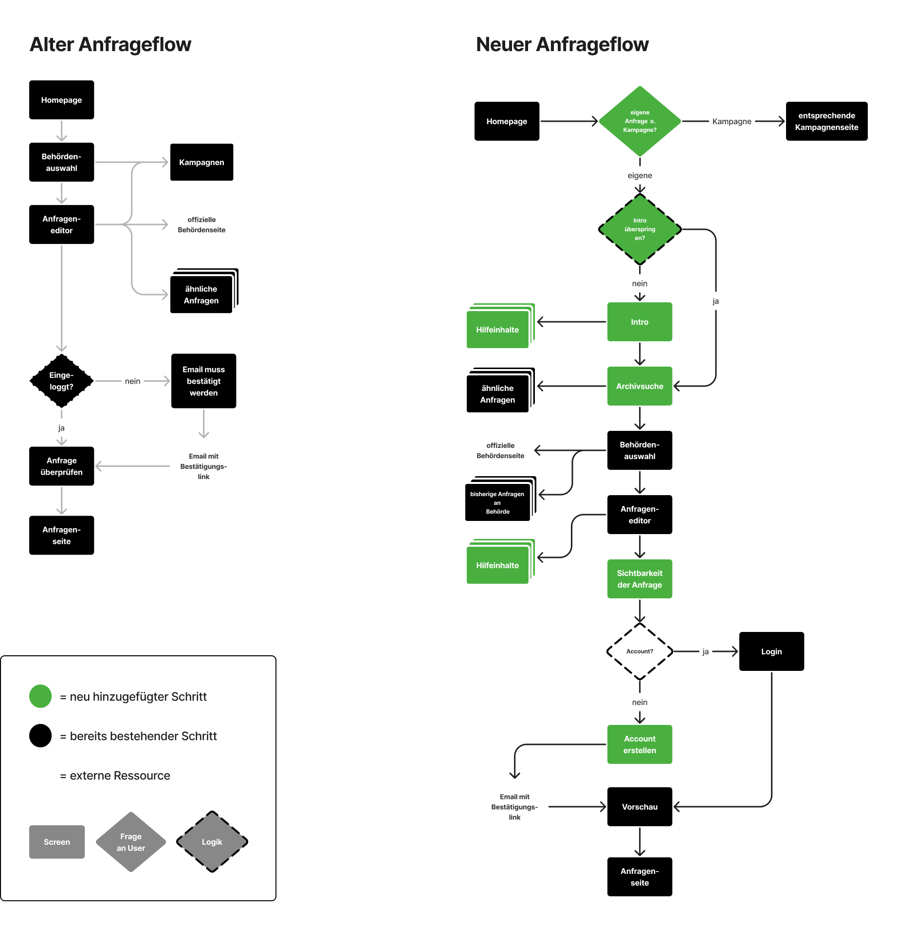
COMPARISON
The new flow is longer than the old one.
The old flow fit a lot of different things onto only a few pages. It may seem faster this way, but it sacrifices usability. Users tend to focus only on those page elements they think are important and end up skipping over the rest. There were crucial bits of information that were often missed.
We know this because some users send support requests to the FragDenStaat team and describe the problems they encounter.
To address this, we decided to introduce additional steps, roughly following the well-tested 'one thing per page' pattern. Our main goals were to reduce cognitive load and be more transparent with users.
One thing per page by Adam Silver on Smashing Magazine
But what about the number of clicks? The number of clicks needed to reach a page isn't a reliable measure of interaction costs. When filling out a form, “users show little concern about how many pages of questions they have to click through, PROVIDED all those questions are easy to answer and clearly relate to the overall purpose of the form.” (source)
The 3-Click Rule for Navigation Is False on NNGroup and
No more accordions on the GOV.UK user research blog
Some selected problems and solutions
This case study explores five examples of issues we encountered with the platform and explains how we tackled them. Feel free to jump to any of them—they can be read independently.
- About searching for things:
- Finding the right public authority
- Nudging users to see what's already there
- About being explicit and transparent:
- Privacy and visibility
- About helping users who need help:
- Providing contextually relevant help
- Screening for users who took the wrong turn
Finding the right public authority
THE Problem
When users write an information request, they often struggle to figure out which public institution is the right recipient for their question. In the previous version, users were asked to search for a suitable authority by entering its name (or parts of its name), which could be challenging if they didn't have a specific authority in mind.
There are more than 10.000 authorities to choose from.
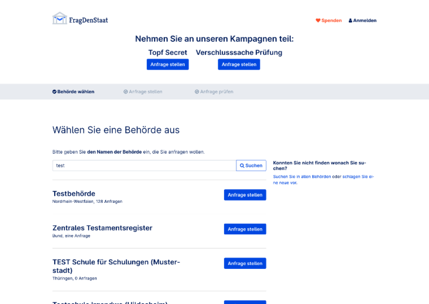
Old version
Users are asked to search for authorities by name.
SOLUTION
We wanted to make the search feature more helpful in narrowing down the set of authorities, so we combined keyword-based search with several filters.
To find out which filter categories would be intuitive in this context, we conducted usability tests on different iterations of the search feature. Our goal was to understand how people mentally organize governmental institutions.
One interesting insight from these tests was that users tend to examine the filter values first and then infer the filter category's meaning from them, rather than relying solely on the category name. Hence, having filter values that convey a consistent story is at least as important as finding precise category names.
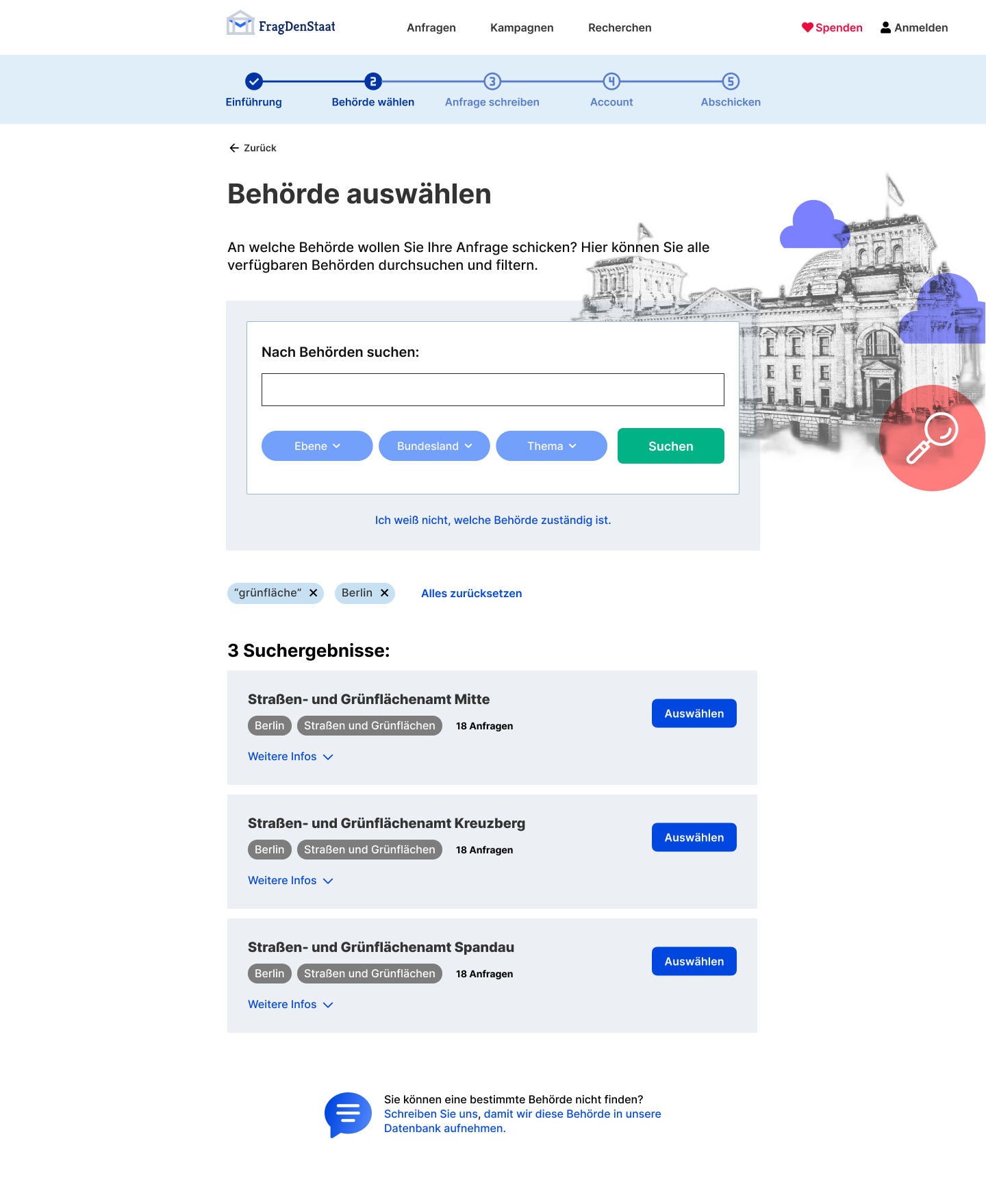
NEW version
Users can search by keyword and filters.
Additionally, rather than asking users to pick one of the search results straight away, we now provide them with more context: for each result they can access links to the official website of the authority and to the FragDenStaat archive. This allows them to explore existing requests sent to that authority.
Archive search: helping users see what's already there
BACKGROUND
There’s a large archive of already submitted information requests, along with replies from authorities.
THE Problem
Some users overlook the archive feature and directly start writing their own information request without checking if the relevant information already exists.
In the previous version, the archive was automatically checked for related requests, but only after users finished writing their own. This step came too late in the flow, creating potential frustration: users would find out that they had wasted their time crafting a request when they discovered a similar one already existed.
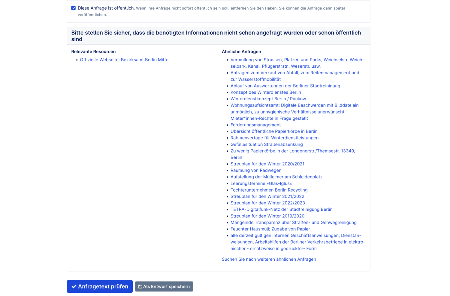
Old version
Related requests get displayed automatically after a user has drafted their own request. They appear as a long unstructured list.
SOLUTION
We introduced a dedicated step in the flow that prompts users to search the archive before proceeding. Users can search by keyword and apply various filters to refine their results.
The search results are designed to be easy to skim through. They offer a glimpse of the request along with important information like the name of the contacted authority and the current state of the request. This allows users to quickly grasp the context and relevance of each result.
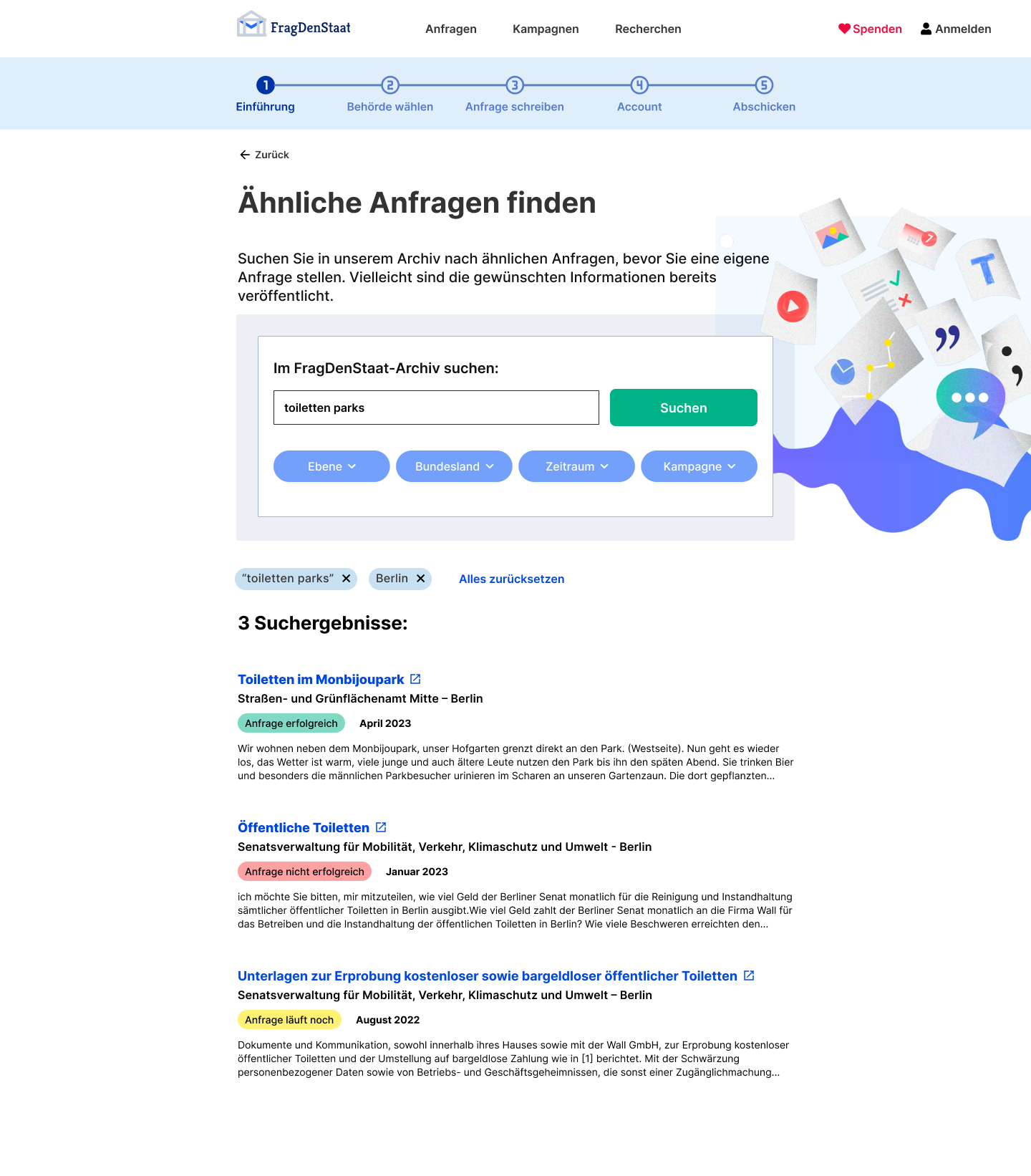
NEW version
Search results are designed to be easily skimmable and provide context.
We used a simple traffic color scheme (the green, red and yellow tags above) to indicate what the current state of a request is (successful/not successful/in progress). This scheme replaces the previously used icon set, which consisted of nine different icons. The icons were visually hard to distinguish and contained distinctions that were too fine-grained for the average user.
OLD version
The old icon set consisted of nine different icons, which were difficult to distinguish and encoded too much information for the average user.
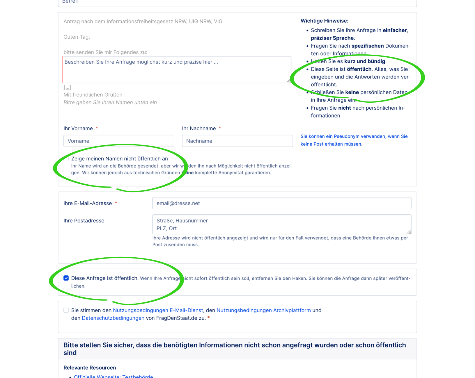
Privacy and visibility on the platform
Background
Privacy settings on the platform are complex. While the authority that a user writes to will always receive this user's name, users can decide if they also want their name to be publicly displayed alongside their request on the platform. They can additionally decide if they want their request to be published immediately or to hold off on making it publicly available, for example because it’s part of their investigative research.
The problem
In the previous version, the privacy settings were not clearly explained in one place. Instead, they were spread out across long forms and occasionally presented in ways that sounded contradictory.
Based on support requests, users often feel confused by the privacy settings. For example, some are unaware that their request will be publicly visible on the website with their name included, leading to frustration.
We also hypothesize that a lack of clear communication about privacy settings might cause potential users to worry and might even make them drop out of the registration process.
OLD version
Information about privacy (circled green) is spread out across a longer form and can easily be missed.
SOLUTION
To ensure better clarity and engagement, we replaced checkboxes with explicit yes/no questions for the user, which are harder to skip over. By using consistent terminology, we clearly differentiate between the various levels of visibility. We provide clear explanations of the different options using accessible language and offer links to additional information for further understanding.
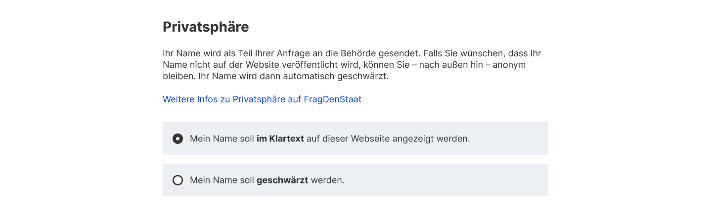
NEW version
Privacy settings are presented more prominently and are harder to skip over. Radio buttons lay out all options, which helps to increase transparency and bring down cognitive load.
To further reassure the user and give them as much control of their submitted information as possible, we play all their answers back to them on a final preview screen.
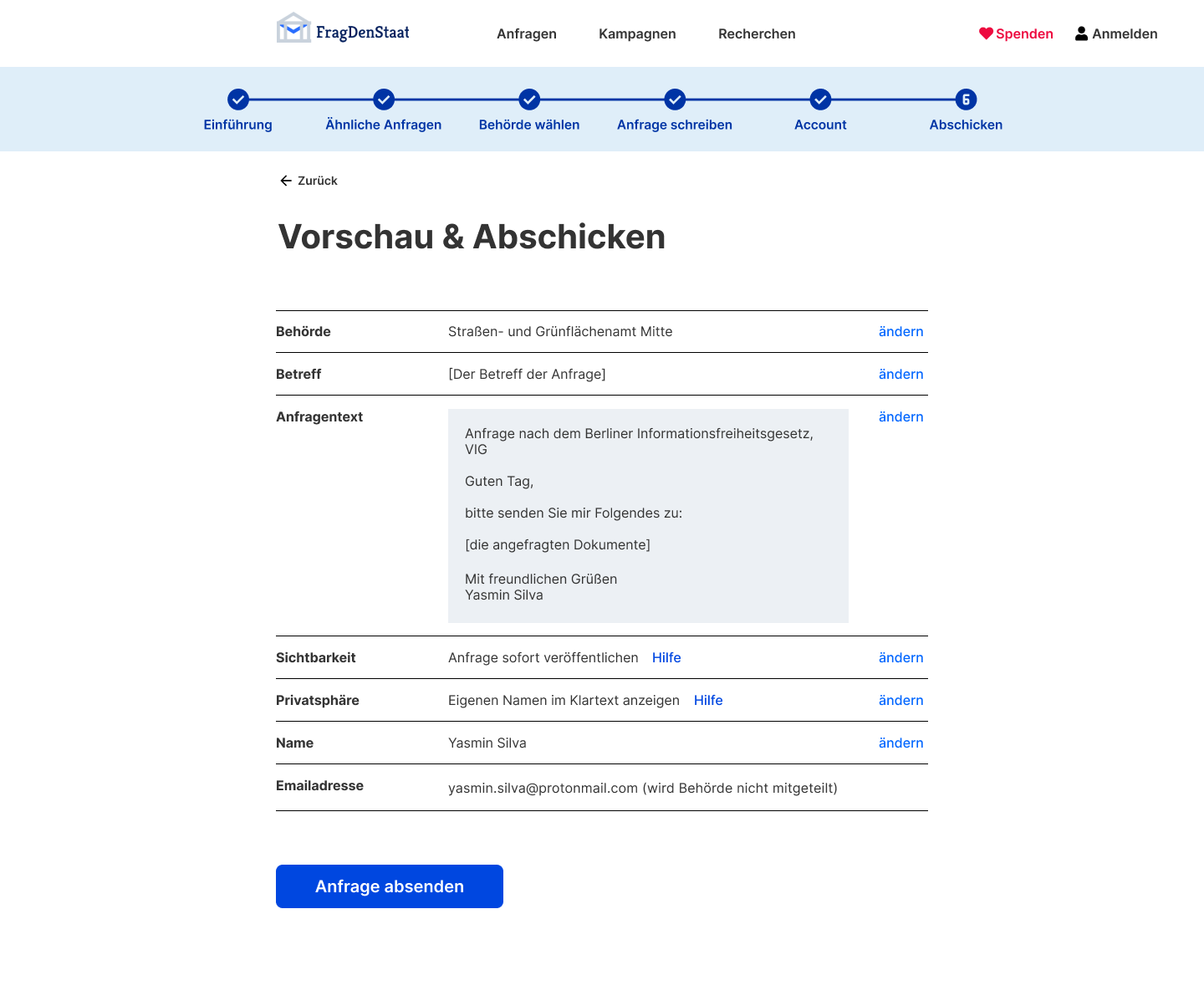
NEW version
A final preview screen summarizes all choices made by the user and the information they have entered.
Providing contextually relevant help
BACKGROUND
FragDenStaat operates based on the German freedom of information (FOI) laws. These laws give everybody an unconditional right to access official information.
Freedom of information laws by country on Wikipedia
THE Problem
Many platform users only have a basic understanding of FOI and struggle with how to apply it. They don’t know what information they can request or how to formulate their requests effectively.
Although FragDenStaat has a help section, it is not seamlessly integrated into the information request process. Users would need to leave their current context and actively search for assistance.
SOLUTION
First, we placed foundational help content about FOI on a separate page at the beginning of the flow, opting for an easy-to-digest video format. So as not to patronize returning users, we made this page skippable.
Second, throughout the flow, we incorporated answers to relevant questions directly within the context where the questions arise. The help content opens in an accordion, allowing users to access it without being taken away from their current context.
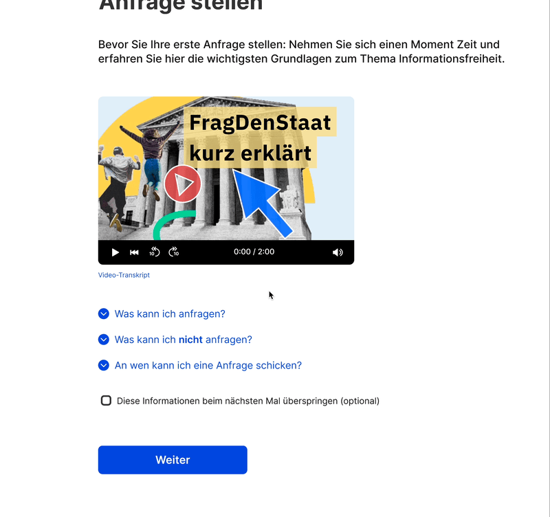
NEW version
Throughout the flow, help content is displayed in accordions.
Screening for users who took the wrong turn
BACKGROUND
FragDenStaat also runs crowd campaigns, where large numbers of users submit thematically related information requests to highlight a certain transparency deficit.
When users visit the website, they have two options: they can either join one of these crowd campaigns or submit their own information request on any topic they choose.
THE Problem
Not all users are aware of this distinction and some end up in the wrong place. Specifically, users who intended to participate in a crowd campaign they saw advertised elsewhere mistakenly enter the flow for writing their own information request. We want to guide these users to the correct page as early as possible.
The previous version of the site used a banner for this purpose, but there were some immediate problems with this approach. First, the banner was visually heavy and contained two prominent calls-to-action. Usability testing showed that it distracted users, making it harder for them to focus on the main purpose of the page. Second, due to a phenomenon known as "banner-blindness" some users may overlook or ignore the banner altogether and never read its contents.
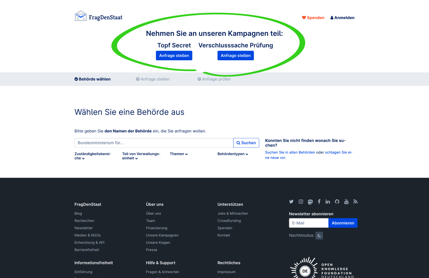
OLD version
A banner (circled green) is used to direct users to crowd campaigns.
SOLUTION
Instead, to screen for lost users who are looking for crowd campaigns, we prefixed the flow with an explicit question: “What would you like to do?” Usability testing had revealed that users are unfamiliar with the website's terminology of "campaigns" versus "information requests." We therefore avoided using the term "campaigns" and instead provided detailed explanations of the available options.
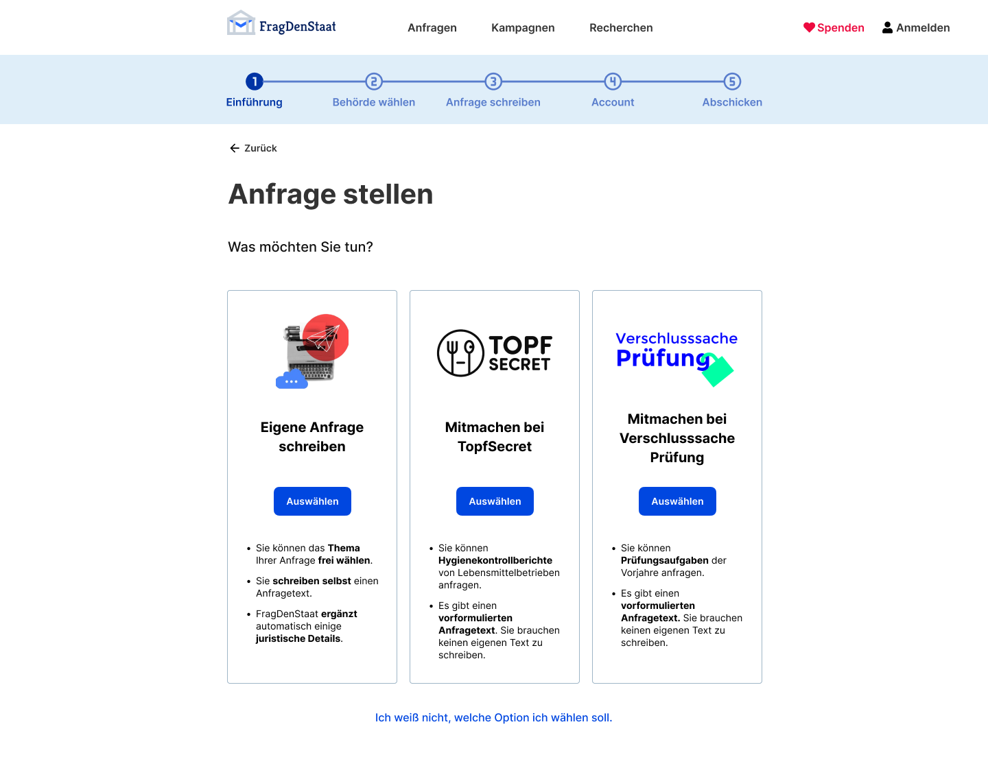
NEW version
The design of this screen roughly follows a "subscription plan picker" pattern, with clear CTAs and room for supporting information.